Tampilkan postingan dengan label PS Tip. Tampilkan semua postingan

Selasa, 14 Agustus 2012

Sunwashed Colored Effect Tutorial


Sunwashed Colored Effect Tutorial is but a simple way to add a golden washed out
effect with some pumped up contrast to an image simply by adding some colored
layers while applying different layer modes and opacity levels within Photoshop.


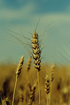
                                                     Before (above)
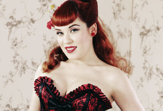


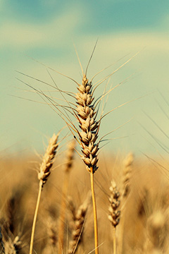
                                                     After (above)


                                                    Before (above)


                                                    After (above)


SUNWASHED COLORED EFFECT TUTORIAL:

1: OPEN AN IMAGE YOU WISH TO USE (WORKS BEST ON PORTRAITS) THIS
    WILL BECOME THE BACKGROUND LAYER.

2: CREATE A NEW LAYER AND FILL WITH THE COLOR ( e79f74) AND SET TO
    OVERLAY MODE.

3: DUPLICATE THE BACKGROUND LAYER AND MOVE TO TOP LAYER, CONVERT
    TO BLACK AND WHITE (Ctrl+Shft+U) AND LEAVE AT NORMAL MODE THEN SET
    THE OPACITY AT 43%.

4: CREATE A ANOTHER NEW LAYER AND FILL WITH THE COLOR (00515) AND SET
    TO SCREEN MODE AND THE OPACITY AT 44%.

5: DUPLICATE THE BACKGROUND LAYER AGAIN AND MOVE TO THE TOP LAYER,
    AND SET TO SOFT LIGHT MODE AT 100%.

6: CREATE YET ANOTHER NEW LAYER AND FILL WITH THE COLOR (a3c1dd) AND
    SET TO COLORBURNED MODE AND THE OPACITY AT 42%.

7: THAT'S IT!


                                                          Before (above)


                                                        After (above)

Hopefully this simple effect can be of some small help whether applying the effect or
help in understanding other ways to apply effects other than by the use of textures,
or actions.

Sabtu, 07 Mei 2011

Aged & Distressed Texture Set + Example

Roll Cursor over image to view rollover effect:


Aged & Distressed Texture Set contains eight large rustic textures which are meant to give your images an assortment of rustic effects.  Just apply one or more textures and try various layer modes and opacity levels to discover various effects. As always, I hope this set can be of some use, and have fun tinkering.


Old and aged painting effect using three of the textures in the Aged & Distressed Texture Set zipped set.


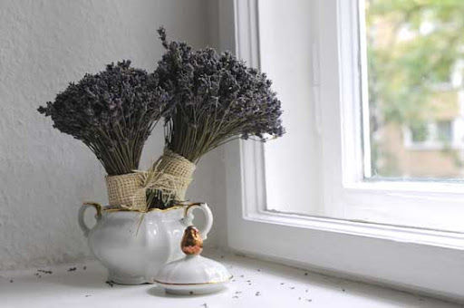
 Step 1: Opened the flower Pot photo "shown above" which automatically becomes the background layer.


Step 2: Opened and added "Vintage 4" texture results shown above, which becomes layer one, then set the layer mode to "Soft Light" and the "Opacity" set at 100%.


Step 3: Opened and added "Whatadifference-7" texture results shown above, which becomes layer 2, then set the layer mode to "Soft Light" and the "Opacity" set at 100%


Step 4: Opened and added "Vintage 1" texture results shown above, which becomes layer 3, then set the layer mode to "Soft Light" and the "Opacity" set at 100%

Step 5: Satisfied with my results shown above, all I need to do now is flatten the layers and save as.


 Posted below are examples of textures in the zipped set:

OldTone-example

Soft-Vintage-example

Vintage-1-example

Vintage-2-example

Vintage-3-example

Vintage-4-example

Whatadifference-3-example

Whatadifference-7-example


Download Zipped Set Here:

Or Download From Here:

OR DOWNLOAD HERE

Jumat, 23 Juli 2010

Photoshop Tip: Turn on the Alignment Options in the Move Tool

Let's face it, you create a new document,copy and paste a new image onto the canvas, and try to position it to the center, if you're a beginner, you may try to judge the center point by using your eyes.  But believe me, your eyes don't always tell the truth.
That's when the alignment options come in handy.  Simply click on the “Move”tool   ( shown below).
   
Image-1  
Then you will see the alignment options appear on the top (menu bar) that I have hi-lighted and shown below.

Image-2

And let's say you want to position an object in the center of the canvas, simply Ctrl+A to select the whole canvas,then you will see some alignment options become clickable.

And then you simply click on "Align Vertical Centers" and "Align Horizontal Centers" you will see the object is now positioned in the center of the canvas.

Like any thing else, the more often you do this, the quicker it becomes second nature.

Selasa, 13 Juli 2010

2 Photoshop Tips

Photoshop Tip 1: How to Draw a Perfect Circle/Square

Here's a quick but basic Photoshop tip for beginners.Let's take a look at the toolbox and find the set of drawing tools as shown below. (To expand, left click on the rectangular tool and hold)


You can use these tools to draw rectangular or oval shapes, as shown below.

Now here's the trick, if you would like to draw a 'PERFECT" circle or a square, you must hold down the shift key while dragging your mouse.

That's it.

..............................................................................................

Photoshop Tip 2: Unlocking The Background Layer

Trust me, there will come a time that you will want to
unlock the background layer, for whatever purpose.
To do so, simply "double click" the background layer on
the layer palette, as shown below.


You will then be prompted with a new window, simply click OK.
And you will now see the lock on the background layer is gone,
that means the background layer is now unlocked.


You can now drag the background layer up and down,just like all
other unlocked layers.

That's it.

Kamis, 08 Juli 2010

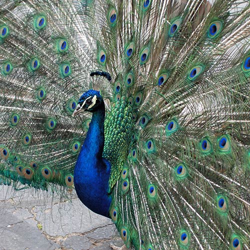
Photoshop Tip: Image Pop Blur / Overlay Effect


Touch image for a before and after "Mouse Over" effect.

This is one of those tricks most of you already know, but for those who don't, you're gonna love it.

This is a simple trick that will make those light or over saturated images pop.  Let's get started.

Open an image you feel needs some help.
Now, duplicate your picture either by dragging it to the "Create New
Layer" icon next to the trash can at the bottom of your Layers Panel
or hitting "Ctrl + J" on the keyboard.

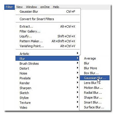
Next we're gonna apply "Gaussian Blur" (Filter/Blur/Gaussian Blur)
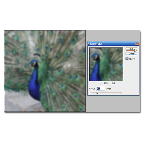
now set the "Radius" slider to 4.0.  Blurry isn't it?
 Now go to the "Layers Palette" and change the "Blending Mode" from
"Normal" to "Overlay."  What a difference!
I sometimes adjust the "Opacity" level, and as seen here I set it at 80%.

If you look at the before and after, you can see that this method makes
the light tones lighter and the dark tones darker while softening it.
Sometimes applying a higher percentage of "Gaussian Blur" along with a
higher "Overlay" percentage gives a dreamier effect.

That's it, hope it was fun.


Senin, 05 Juli 2010

Photoshop Tip: Scattering Brushes

Photoshop Tip: Scattering Brushes

This is a tip done in Photoshop CS3, and I'm not sure which older versions are compatible, certainly CS3 and newer.

To scatter a brush shape about randomly in different sizes and at different angles, click on your brush tool.
Click on the brushes tab up on the upper right corner of your Photoshop window (or hit F5).

Click on "Shape Dynamics." Set your "Size Jitter" slider somewhere between 50-75%. Ifyou don't want your brush size to get smaller than a certain size,set your "Minimum Diameter"slider to whatever percentage you think will fit.  To change the angle of the brush, set the "Angle Jitter" slider low or high, depending on how much you want the brush to tilt to one side or the other. Make sure everything else is at 0% or off.


Now, click on "Scattering," and then set the sactter slider as low or high as you'd like. You can see how much it's scattering in the thumbnail. Click on "Brush Tip Shape."  Move the "Spacing" slider to the right until the brush is spaced how you'd like.  Make sure the rest is set at 0% or off.


That's it!  Now paint with your brush.

NOTE: Everytime you want to do this with a brush, you will have to set these settiings to your liking, so play around with the controls and get to know the settings so it becomes second nature and comfortable.


Rabu, 23 Juni 2010

Photoshop Tip "Brush Fading"

BRUSH FADING, here's a Photoshop brush tip many of you may not have heard of, or maybe it's something you may have forgotten over the years.

There's a way to make a brush "Fade Out" as the stroke continues.  Almost like a real paint brush would.


Select a basic brush with your "Preset Picker."  About 25 pixels or so would be a good size.  Now, click on the "Brushes" tab on the upper right of your Photoshop working space ( or hit F5 ).

Click on "Shape Dynamics" and make sure Size Jitter,Minimum Diameter,Angle Jitter, and Roundness Jitter are all set at 0%.   The Controls after Angle Jitter and Roundness Jitter should be set at "Off." (As Shown Above)

Now, next to the Control under "Size Jitter", click the small arrow on the right and select "Fade."
In that small box to the right of it, put in a number, somewhere between 50 and 300.  Depending on how long your line is.  This value is how many pixels out you want the line to go before it starts to fade out completely.

Now take the brush and paint on your canvas.  You'll see it "Fade Out" as it goes on.  What it's now doing is becoming smaller and smaller until the brush size is 0 pixels.


You can also make it actually fade out.  Instead of (or in addition to) clicking on "Shape Dynamics," click on "Other Dynamics" under the brush tab menu.


Set everything to 0% and "Off" as before.  Under the "Opacity Jitter" slider, change the "Control" on that to "Fade."  Now, in the small box to the right of it, put in a value like you did before, 50 to 300 pixels, or as long as you need it to be.  This works the same way, but it will actually fade out, instead of getting smaller, and actually I use both settings.

They both have their own different uses, but also work very well together.

Well, hopefully you learned something new here, and you may want to keep an eye out for more Photoshop tips in the near future.

Minggu, 16 Mei 2010

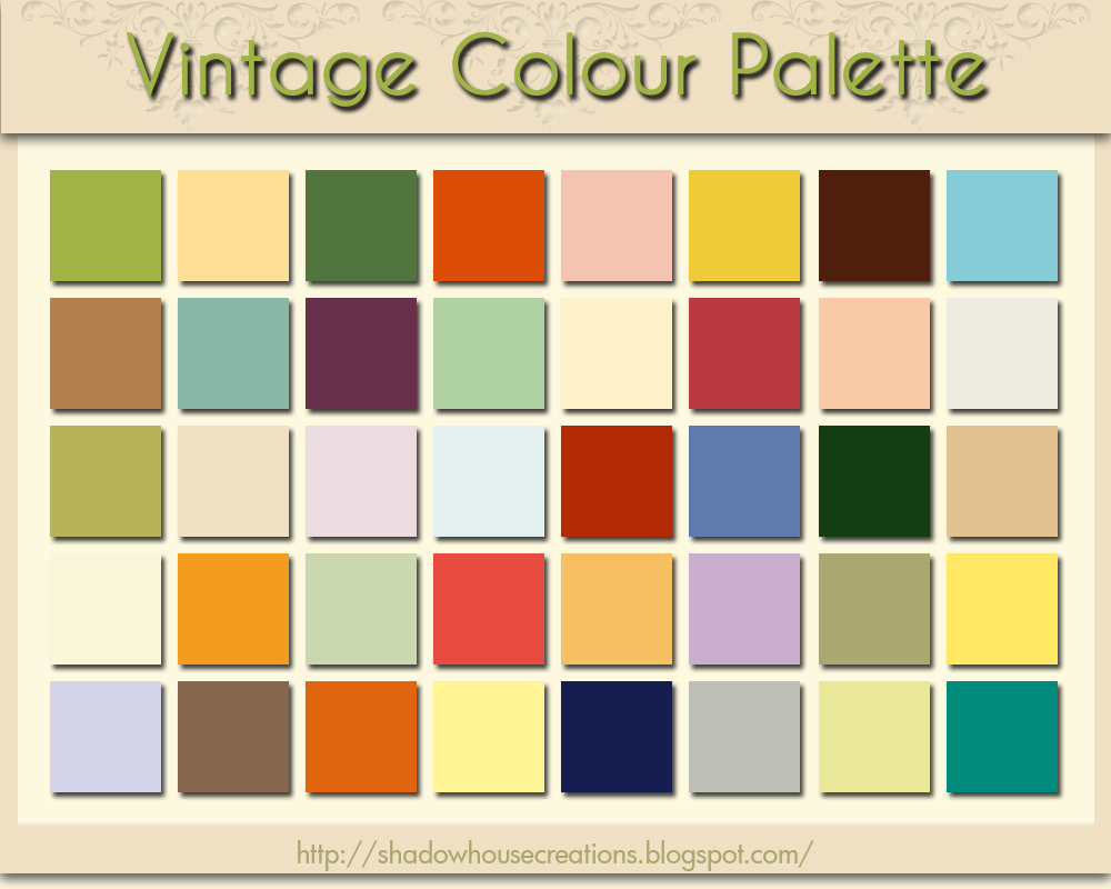
Vintage Colour Palette

Click Image For Larger View

VCP ~ Download


 Just a little something I put together to show the vintage
tones I use quite often in photoshop.  When I need a colour
I just put the photoshop eyedropper on the square I want and
make a new fill layer then adjust the opacity and layer mode
to my liking.

If it may be of any use, feel free to download.

The after example 1 posted, shows the (RGB) green colour swatch
(170-167-112) applied at 86% opacity at Linear Burn mode.

I know there's plenty of actions to accomplish the same results
but I like learning the tools and their uses rather than the one
click quick fixes.  I find it fun to tinker.

 Sample 2 was composed,using (RGB) color (235-196-93)
set at 48% opacity and Linear Burn mode, plus the (RGB)
color (159-196-194) set at 38% opacity and Color Burn mode.


      Original Image                    After Image 1                   After Image 2

Sabtu, 01 Mei 2010

Texture Examples

Leaving Home:

Oil Painting 3 was applied to the image using layer mode set to "Hard Light"
at 100% opacity. Then I added a copy of the background image, and set the
layer mode  at "Screen" and the opacity at 29%.

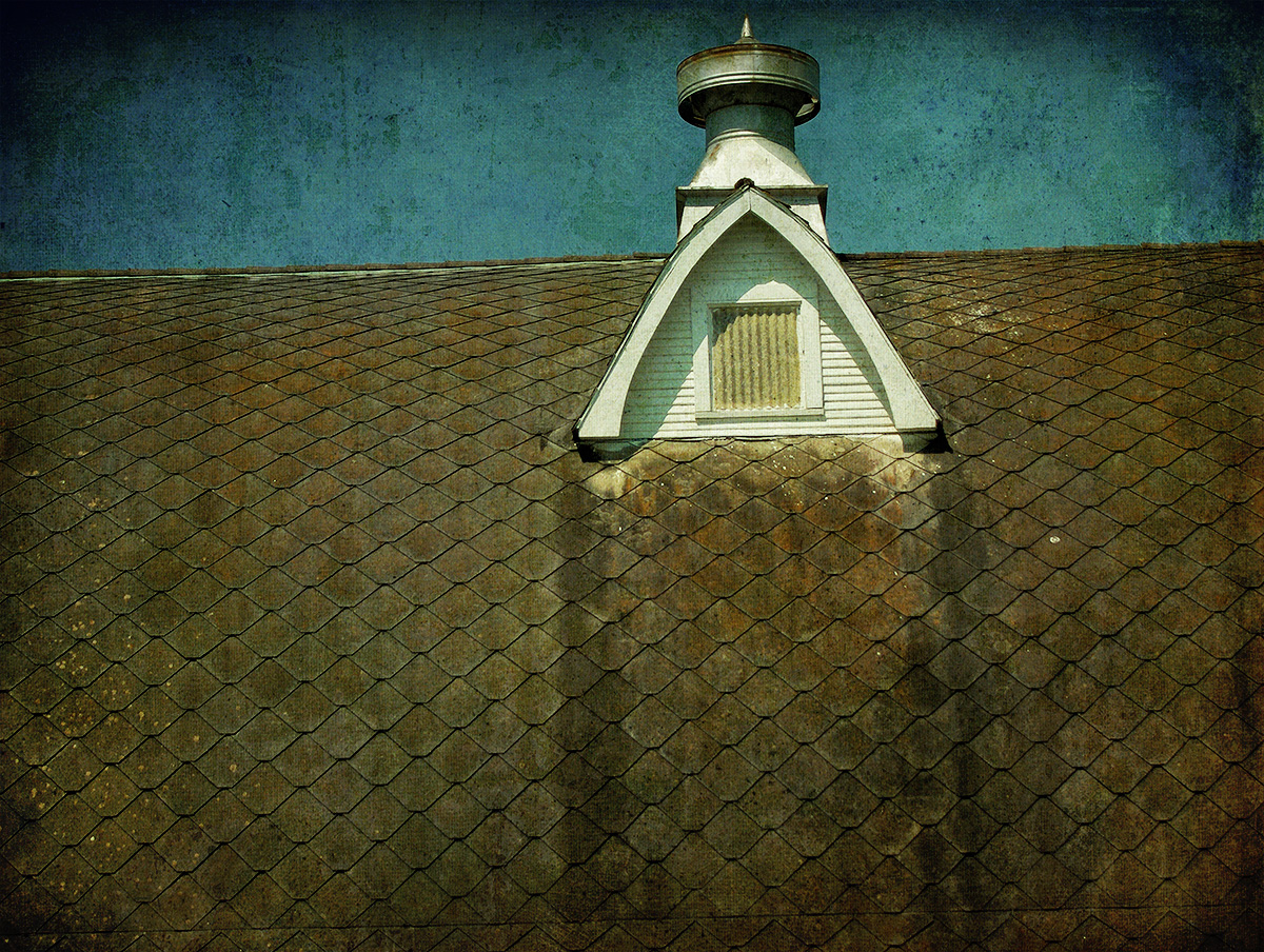
Atop the Barn:

Simply using "Aged 2" texture with the layer mode set at "Overlay"
100% opacity and the "Soft Grunge 1" texture set at layer mode
"Linear Burn" and the opacity at 66%.

Senin, 22 Maret 2010

Letting Loose .....

Letting Loose, originally uploaded by SkeletalMess.

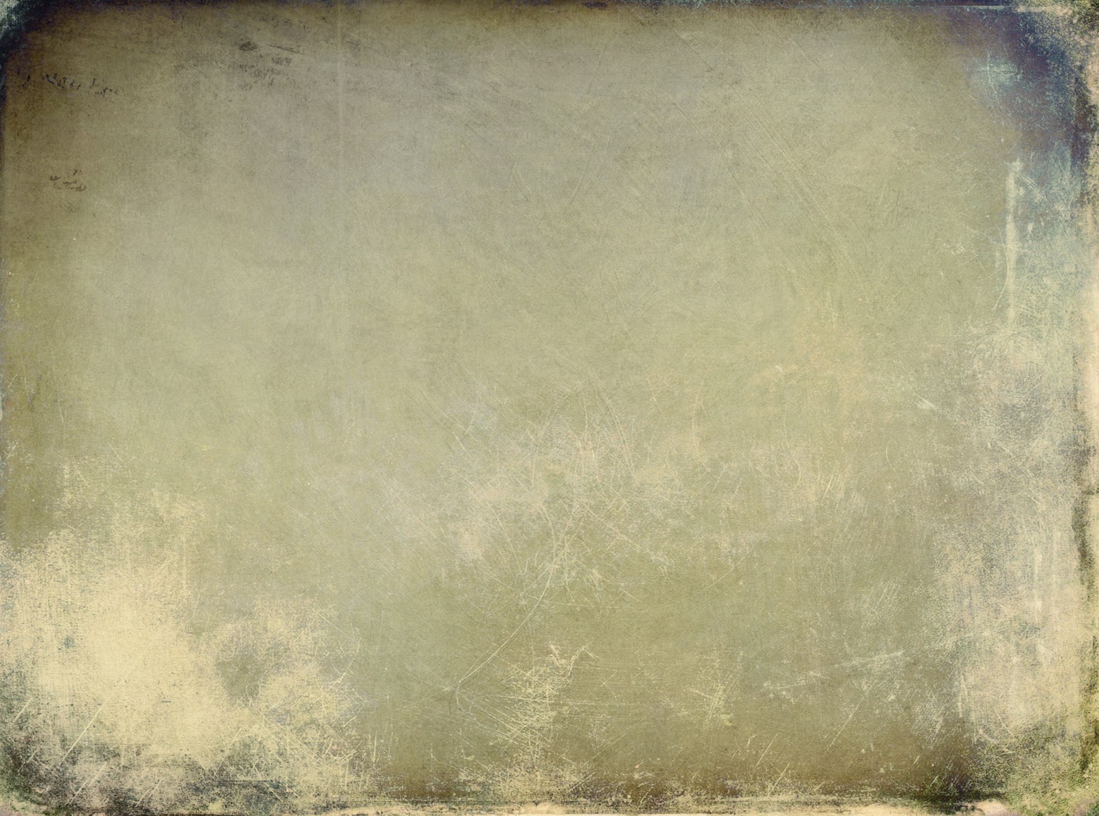
Image textured effects were  created using the two textures posted below.
Originally the textures were to be for the cover of a book, a side project
but I thought I'd post them for others to use.  Careful, they're large files.

Rabu, 03 Maret 2010

Before & After


I thought I would show how a texture can be of value for 
bringing out the rich tones without having the texture effects.
The before shot is somewhat washed out and the colors are
faded and blah!

The after shot is much more rich in tones, and looks so much
better than the before shot.  All I did was use the Grunge Palette
Texture below and set the layer mode to "Soft Light" and the opacity
to 78% in Photoshop, simple but effective.


Selasa, 02 Maret 2010

Creating A Texture Tutorial Promo

It took a while to complete, but here's a tutorial explaining how I go about making my textures, hope it helps others wanting to make their own.